Skip to content
-
Subscribe to our newsletter & never miss our best posts. Subscribe Now!
  • Home
  • About Us
  • Advertise
  • Blog
  • Cart
  • Checkout
  • Contact us
  • Disclaimer
  • Full Width Template (Theme)
  • Home
  • My account
  • Privacy Policy
  • Shop
  • What we deliver
  • Why are we the trusted Choice
  • Home
  • About Us
  • Advertise
  • Blog
  • Cart
  • Checkout
  • Contact us
  • Disclaimer
  • Full Width Template (Theme)
  • Home
  • My account
  • Privacy Policy
  • Shop
  • What we deliver
  • Why are we the trusted Choice
Close

Search

  • https://www.facebook.com/
  • https://twitter.com/
  • https://t.me/
  • https://www.instagram.com/
  • https://youtube.com/
Subscribe
Movie News

Even the Letters Roar When Legends Unite!

By Admin Team
February 21, 2026 2 Min Read
0

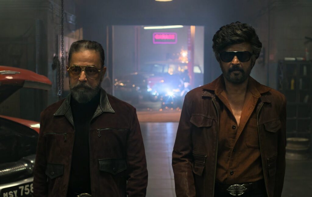
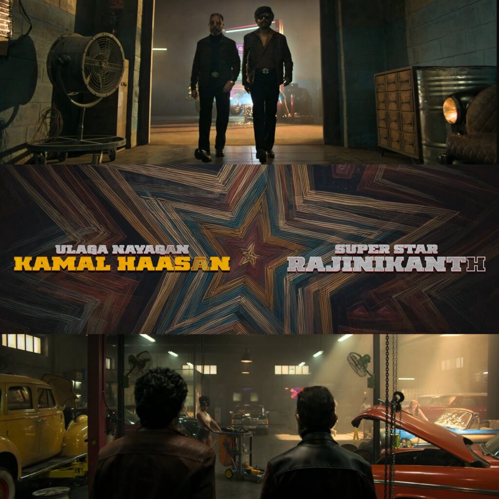
Why Do the ‘A’ in Kamal Haasan and ‘H’ in Rajinikanth Look Different? Hidden Detail or Smart Design?

A recent post has sparked curiosity among fans — why does the ‘A’ in Kamal Haasan and the ‘H’ in Rajinikanth appear visually different in the promotional material? Is it just a design choice, or is there a deeper meaning behind it?

Here’s a possible theory.

Oplus_131072

Designers often use typography to subtly reflect personality and legacy. The stylized ‘A’ in Kamal Haasan could represent sharpness, creativity, and experimentation — qualities strongly associated with his career. Kamal is known for pushing boundaries, reinventing cinema, and taking intellectual risks. A unique letter design might symbolically reflect that artistic edge.

On the other hand, the bold or distinct ‘H’ in Rajinikanth could represent stability, power, and mass dominance. Rajinikanth’s brand has always been about larger-than-life presence and unmatched fan following. A strong, grounded typography style could visually communicate that authority.

Another interesting possibility is balance. When two legends share the same frame, designers might intentionally differentiate specific letters to subtly give equal visual weight to both names. It prevents one name from overpowering the other and creates a sense of symmetry in branding.

There’s also the marketing angle. Small design changes generate discussion. When fans start noticing such details, it increases engagement and social media traction — exactly what promotional teams aim for.

So is there a hidden secret? Maybe not a story twist — but definitely a smart creative decision. In big collaborations, even a single letter can carry meaning.

Author

Admin Team

Follow Me
Other Articles
Previous

Legendary Collab: Rajini and Kamal’s Retro Gangster Twist

Next

Netflix’s ‘Accused’ (2026): Everything You Need to Know Before the Premiere

No Comment! Be the first one.

Leave a Reply Cancel reply

Your email address will not be published. Required fields are marked *

Daily Updates(X)

  • Seethapayanam Bookings
  • Jananayagan Censor Update
  • Krish 4 Update

Recent Posts

  • Can 125 Movies Turn Delhi Into the World’s Next Film Hub?
  • Could a Paperwork Mistake Actually Help Kangana Win Her Copyright Battle?
  • Is This the Deal That Finally Prevents War with Iran?
  • Why is Arijit Singh Still Singing? The Star Finally Clears the Air.
  • Is the Clock Ticking for Putin? The Secret Deadline That Changes Everything.

Recent Comments

No comments to show.

Archives

  • February 2026

Categories

  • Advertisment
  • Daily Updates
  • Movie News
  • OTT
  • Political
  • Reviews
  • Uncategorized

Biggest Pan India Movie By Yash is set to release on March 19

Thalapathy Vijay's Most Anticipated Movie Jana Nayagan is expected To release On Feburary 20
Dude Postponed To March 27
Copyright 2026 — . All rights reserved. Blogsy WordPress Theme